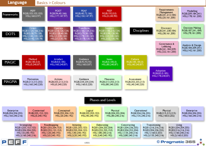
Here we detail Pragmatic's use of colour. Colour is not used
to make think look pretty.
Pragmatic uses colour to aid peoples understanding as colour
is an excellent way for the mind to quickly take in and relate information.
Some people like to see colour (information) others see it
as extraneous and creating more confusion that clarity. Others like colour but
just not like Pragmatic's choice of colour and would change them in certain
ways, such as making them more muted, or only using colour to represent the
type of thing – e.g. instead of using the 40 colours shown here, use one colour
for each set of colours.
...to read more, please Login or Register